UX Case Study
Art Event Discovery App
Finding and trusting the art happening around you, made faster and clearer.
- Product Design · A.R Krishna
- UX / UI Design
- Mobile
Your Partner for Digital Innovation
UX Case Study
Finding and trusting the art happening around you, made faster and clearer.
The product
Browse, save, and get to the event in one continuous flow, with no dead ends.
Introduction
This project focuses on improving how you find and trust local art events. The work covers research, structure, and experience design. The goal stays simple: help you discover relevant art events faster, reduce confusion, and build trust.
Overview
Art events live across social media, flyers, and private groups. Information stays scattered, details stay incomplete, and trust stays low. You miss events, or attend ones that fail expectations.
The solution focused on personalized onboarding, location based discovery, verified event details, and a simplified booking flow. Clear information architecture and community reviews improved trust, reduced search time, and helped users discover and attend relevant art events with confidence.
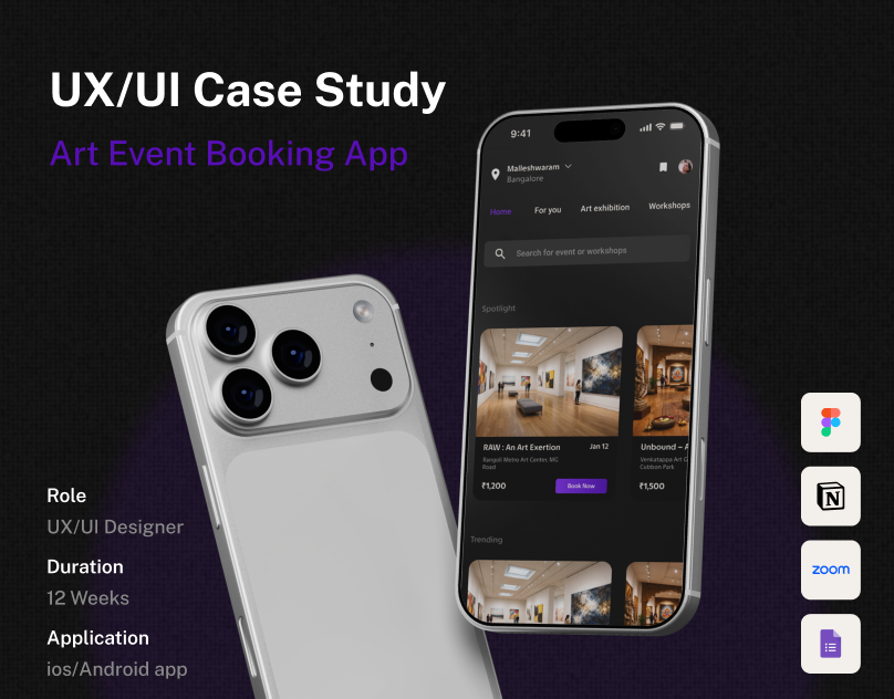
The design process moved through multiple stages that progressed in parallel, with research, ideation, and testing evolving together instead of following a strict linear sequence.
Stage 01
Stage 02
Stage 03
Stage 04
Stage 05
The project followed a structured weekly plan, moving from research and empathy to final handoff. Each week focused on validating decisions before progressing, keeping the solution aligned with user needs and project goals.
User Flow
Designed with simplicity in mind, the experience guides you through an intuitive journey: from onboarding, to exploring events and workshops, to clear step by step actions and participating with confidence.
A user persona represents the target user based on research insights. It captures goals, behaviors, pain points, and motivations, so design decisions sit on real user needs instead of assumptions.
Riya explores art after work or on weekends. She prefers calm and curated experiences. She values clarity before committing time or money.
Empathy Map
The empathy map gathers observed and reported signals into four quadrants, surfacing the motivations and frustrations that shaped the product decisions.
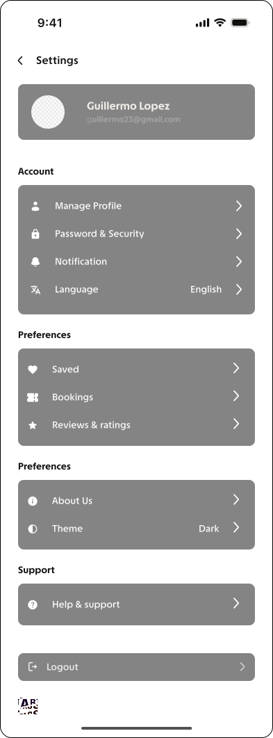
The product is organized into clear sections to reduce confusion and speed up discovery. The main structure includes Home and Discovery, Categories, Event Details, Notifications, and Profile and Settings. Events are grouped by type, with filters separated from actions, for intuitive navigation and a logical content flow.
Flowchart
The flowchart maps decisions, actions, and possible paths through the product. It surfaces gaps, edge cases, and friction points before moving into detailed design.
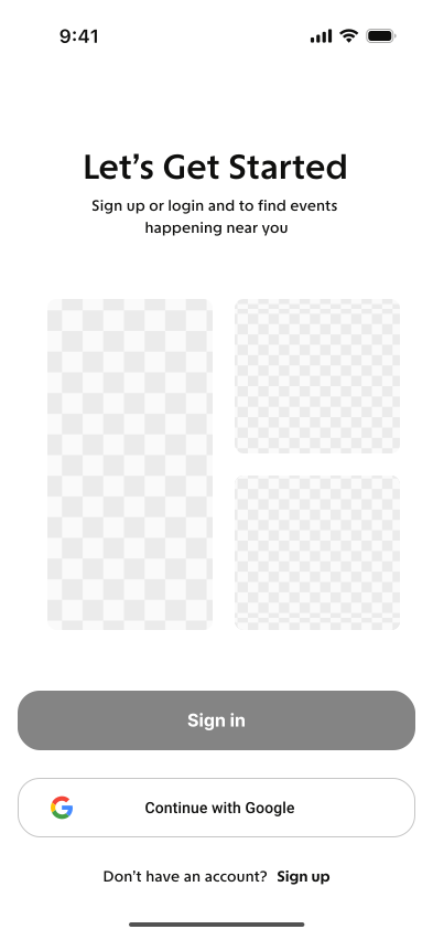
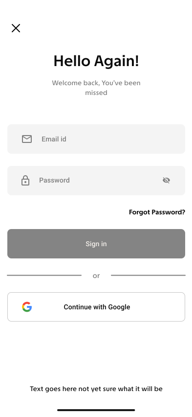
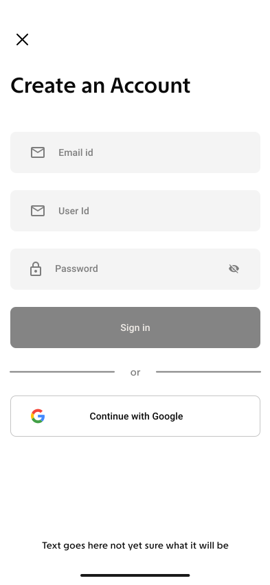
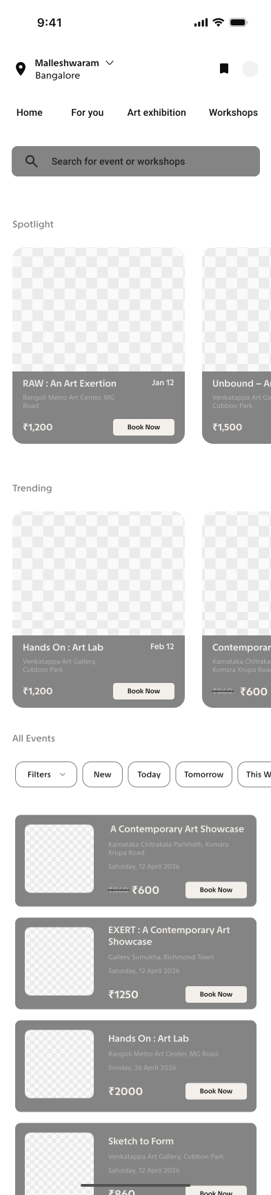
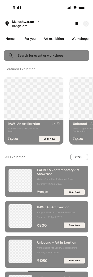
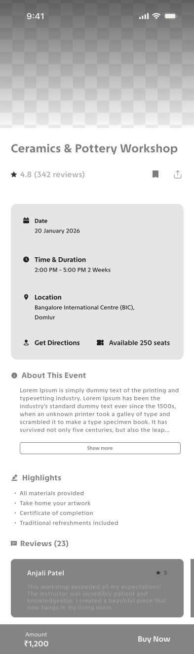
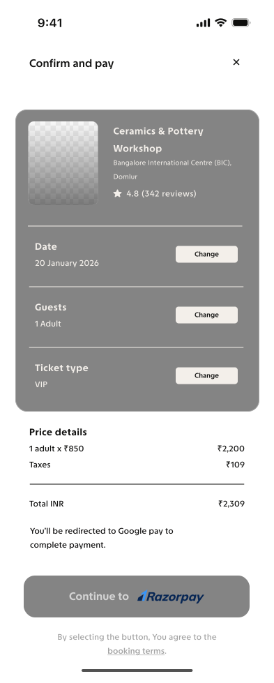
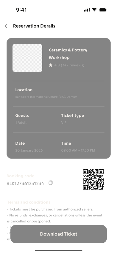
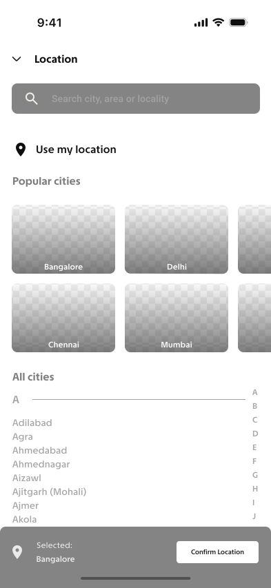
Wireframes outline the basic structure of the product: layout, content placement, and user flow without visual styling. They test ideas early, spot usability issues, and align on structure before moving to high fidelity design.

Design System
The typographic system defines text styles as design tokens and explains how titles and body text should be applied.
TASA Explorer
| H1 | Semi Bold | 14 px |
|---|---|---|
| Button | Semi Bold | 12 px |
| P | Medium | 12 px |
| P2 | Regular | 12 px |
Color guides attention, highlights key actions, communicates status, and strengthens brand identity. It improves clarity, readability, and shapes how you experience the product.
Iconography enables quick recognition and easier navigation. Consistent icons reduce cognitive load, clarify actions, and strengthen usability across the interface.